GIMP text effect guides

Click on the designs below to jump to their tutorial!

[Download XCF]
- For a pixelated look, working at small image sizes is recommended. This example uses a size of 226x60 pixels
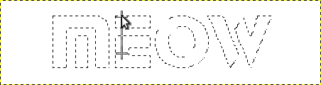
- Type your text! This example uses the "Stop" font at a size of 55
- Use Layer > Transparency > Alpha to selection to select all the opaque parts of the text layer.
- Create a new transparent layer and make the original text one invisible. Fill the selection with a gradient of your liking. I recommend using a brighter and a darker color. This example went with #ff5500 and #680d0d, and a Bi-Linear shaped gradient placed as follows:
- While still keeping the selection, create a new layer placed above the gradient one which will be used for the gloss effect. Set the foreground color to white and background to black, then with the Blend tool set the gradient to FG to BG (RGB) and the Shape to Shaped (angular). Drag with the Blend tool anywhere around the canvas to draw the gradient. The result should look similar to this:
- Change the layer's mode to Dodge (at the dropdown above the layer list) and tweak the opacity to your liking (This example went with an opacity of 45%) You may also experiment with other layer modes!
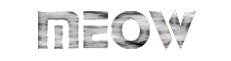
- Create another transparent layer for the metal texture effect, placed between the gloss and text ones. While still keeping the selection, use Filters > Render > Clouds > Solid Noise. Increase the Detail level and tweak the values to your liking. You can use the New Seed button to get a new random noise pattern. This example used a X/Y size of 4.0 and detail of 15, plus the seed 3614762026
- Use the filter Enhance > Sharpen to make the texture more crisp. Setting it to a high value will also give it a neat bright border. This example used a value of 55
- Set the layer blend mode to Soft Light. This example left the opacity at 100%. You may try other modes, as well as changing the opacity to make the effect less intense
- Discard the active selection (with Select > None)
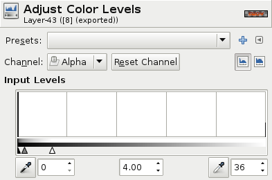
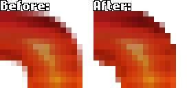
- Now, if you'd like a crisp pixel look, perform this step on each of the three layers: Select the Colors > Levels tools and set the parameters as follows (don't forget setting the channel to Alpha!) then apply the changes. You may as well experiment with the values to adjust the borders to your liking. You may also perform this just after step 3, with slightly different results
- Make a copy of the text gradient layer which will now be used as a shadow and place it below all other layers. Carefully displace it by 1 pixel down and 1 pixel to the right. Open the Colors > Brightness-Contrast tool and decrase the brightness to your liking. This example decreased the brightness by the max value of -127, plus increased the contrast by 5
- Make a copy of the shadow layer and place it below all other layers. Displace it a few pixels below and to the right then reduce the opacity of the layer to your liking. This example displaced the layer 2 pixels below and right and set the opacity to 64%
- Your text is now finished! Have fun and always experiment with your own ideas! ^-^